You have a contact form. It's on your website. You've told people to reach out. And yet, the enquiries are thin.
The form is there. The traffic is there. Something isn't connecting.
In most cases, the problem isn't that people don't want to contact you. It's that your contact form – in its current state – is creating friction, communicating the wrong things, or simply not working the way you think it is.
This is one of the highest-leverage problems to fix on a small business website because the solution is cheap and fast, and the impact is immediate.
The Most Common Reasons Contact Forms Fail
1. There are too many fields
Every additional field in a form reduces completion rates. This is not a theory — it's consistently demonstrated across conversion research.
Ask yourself honestly: do you really need the prospect's company size, their website URL, their budget range, how they heard about you, and a free-text message field just to start a conversation?
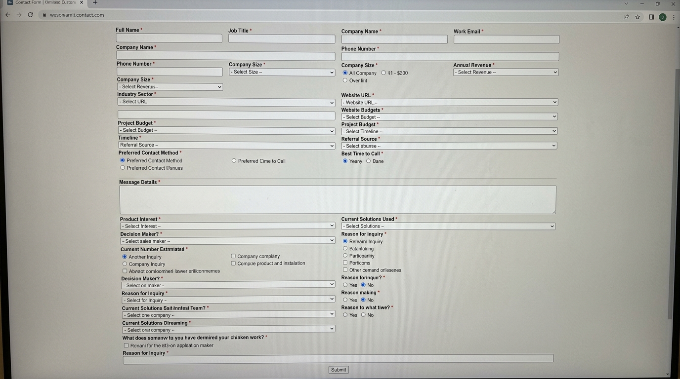
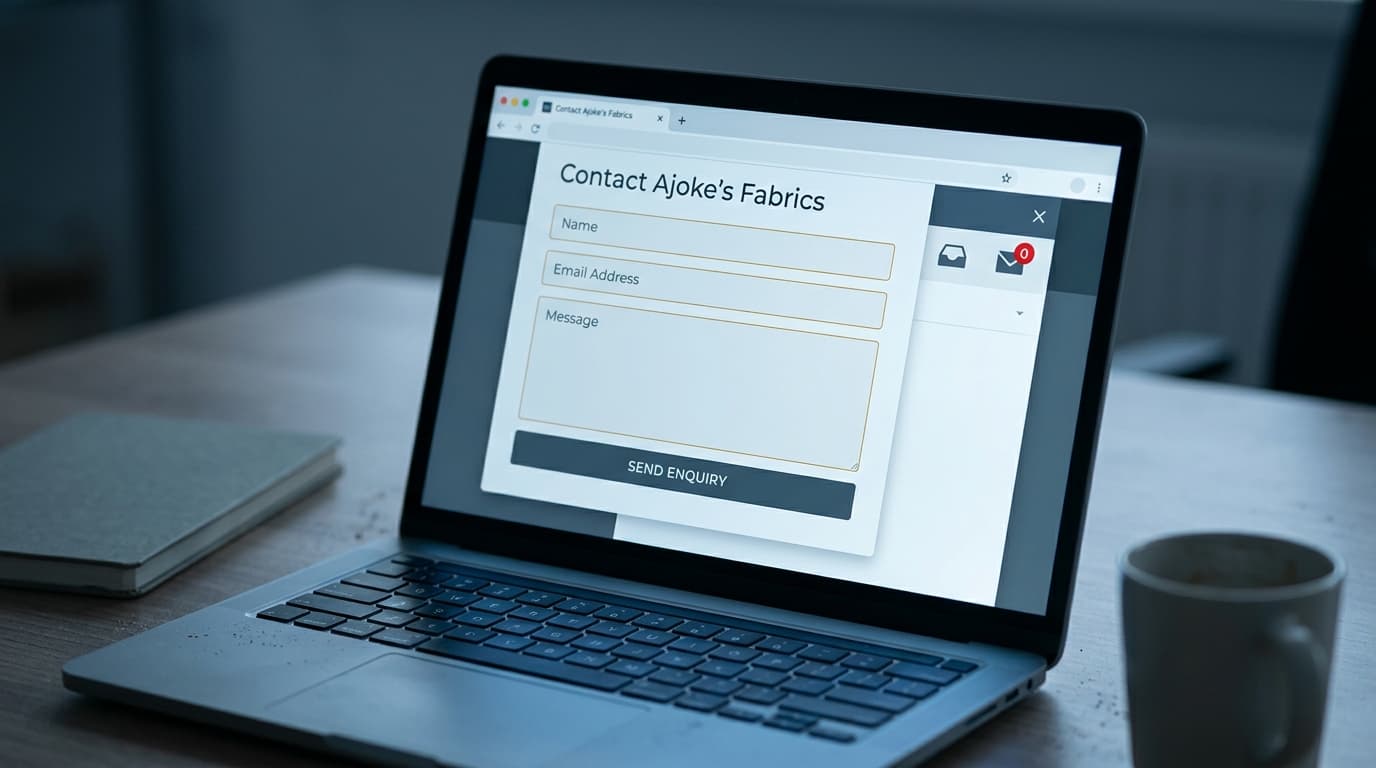
The minimum viable contact form for most service businesses is three fields:
- Name
- Email (or phone number, depending on how you prefer to follow up)
- What can I help you with? (a short, friendly message field)
That's it. Everything else can be discovered in the first conversation.
2. The form is sent to an email address nobody checks regularly
This sounds obvious, but it's very common. The form submission goes to an admin email, a general enquiries inbox, or an old address that the business owner set up once and forgot about.
Test your own form right now. Fill it out with a test message. See how long it takes to arrive and where it arrives. If the answer is "I'm not sure," you've found the problem.
3. There's no confirmation that the submission worked
After someone fills in your form and clicks submit, what happens?
If the answer is "the page refreshes" or "nothing obvious", you're creating doubt. The person who just took the step to contact you now wonders, 'Did that actually go through?', 'Should I try again?', 'Should I email instead?'

A proper form submission should trigger:
- An on-page confirmation message: "Thanks! We'll be in touch within 24 hours."
- An automatic confirmation email to the person who submitted: "We've received your message and will respond by [time frame]."
Without these, you lose conversions from people who submitted successfully but weren't sure — and potentially get duplicate submissions from people who tried again.
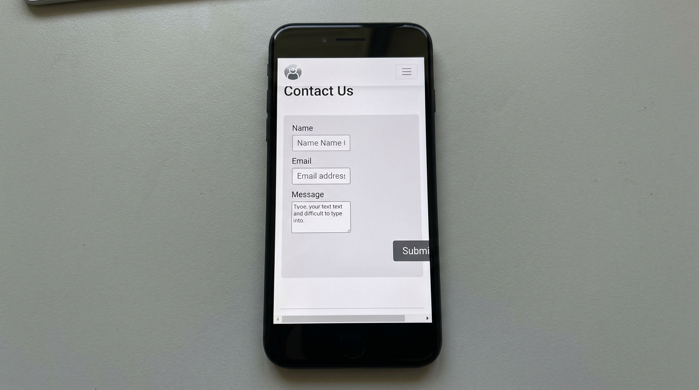
4. The form looks broken on mobile
More than half of web browsing in Nigeria happens on mobile devices. If your form is difficult to fill in on a phone — with fields that are too small to tap, a submit button that's cut off, or a layout that doesn't reflow properly — you're losing a significant portion of your potential contacts before they get started.
Test your contact form on your own phone. Try filling it in. Be honest about what you find.
5. There's no reason to use the form
"Contact Us" is not a compelling call to action. It says nothing about what happens next, why someone should bother, or what they'll get.
Compare:
- "Contact us" — generic, low commitment, says nothing about outcome
- "Book a free 20-minute strategy call" — specific, low-risk, outcome-oriented
- "Tell us about your project — we'll respond within 24 hours" — warm, sets expectations, human
The way you frame the ask affects whether people take it.
How to Fix Your Contact Form (In a Day)
Step 1: Simplify the fields
Cut everything that isn't essential. Name, email, and a brief description of what they need. That's your default. If your business genuinely needs more qualifying information, consider a two-stage approach: collect the basics first, then send a more detailed intake form once the relationship is established.
Step 2: Test where the submissions go
Fill in the form yourself and confirm where the email arrives, how quickly it arrives, and whether anyone is checking that inbox. Reroute if necessary.
Step 3: Add confirmation messaging
Configure your form tool to show an on-page confirmation message on submission. If your platform allows it, set up an automatic confirmation email. Most form tools (Tally, Typeform, WPForms, and Contact Form 7) make this straightforward.
Step 4: Check mobile experience
Pull up your contact page on your phone and fill it in. If anything is annoying, it's a problem. Fix it.
Step 5: Rewrite the call to action
Replace "Contact Us" with something specific and human. Give people a reason to submit the form. Set an expectation of what happens next. Make it feel like the start of a conversation, not a bureaucratic form.
Go Further: Connect Your Form to Your CRM
If your contact form is submitting to an email inbox, you're still managing leads manually. Every time a submission comes in, someone has to read it, decide what to do, and track the follow-up somewhere.
A better setup: connect your contact form directly to your CRM (Zoho, HubSpot, Pipedrive). When someone submits the form, a lead is automatically created in your pipeline, tagged with the right stage, and assigned for follow-up.
Tools like Zapier make this connection possible without any coding. The result: no lead gets lost in an inbox, no follow-up gets forgotten, and your pipeline updates itself.

The Quick Win You're Missing
Most of the businesses we audit have some version of this problem — a contact form that technically exists but practically fails. Fixing it requires no new tools, no significant investment, and usually less than a day of focused work.
The leads are coming. Your form might just not be catching them.
Conclusion
A broken contact form is one of those problems that looks invisible from the inside. You see the form on your website and assume it's working. But the prospect who tried to reach you and gave up – you don't know they were ever there.

Fixing this is one of the fastest ways to improve your conversion rate without spending anything on advertising.
Book a free conversion audit with our team — we'll review your contact form, your calls to action, and the full path from visitor to lead and tell you exactly what to change first.